Project overview
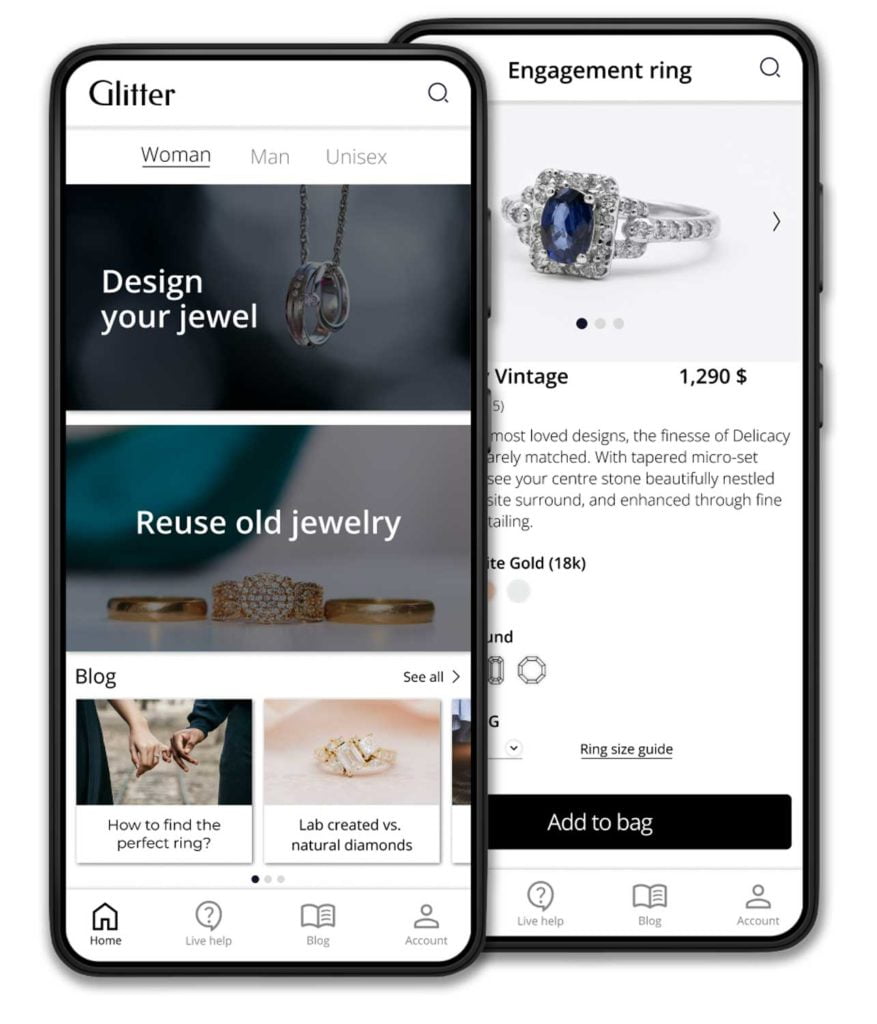
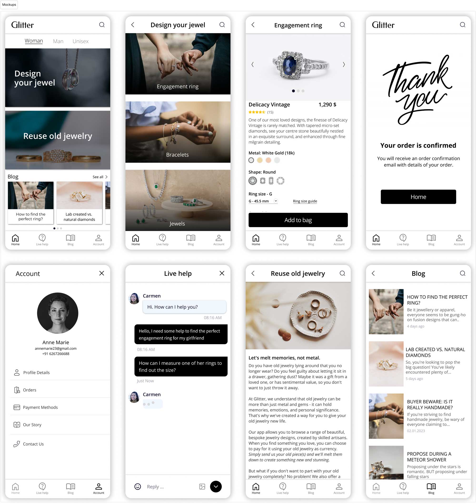
We’re creating a new jewelry app to help people order custom jewelry and you can choose to pay for it using your old jewelry as currency.
The problem
- People feel frustrated when seeing the same jewelry on others;
- People don’t want to throw old (with personal significance) jewelry
The goal
Design an app that allows user to order unique jewelry and choose to pay for it using old jewelry as currency
Target audience
Women and men between the ages of 16 to 55
My role
UX designer designing Glitter app from conception to delivery.
Responsibilities
Conducting interviews, paper and digital wireframing, low and high-fidelity prototyping, conducting usability studies, accounting for accessibility, and iterating on designs.
Understanding the user
User research: summary
I conducted interviews and created empathy maps to understand the users I’m designing for and their needs. A primary user group identified through research was people who feel frustrated when seeing the same jewelry on others.
This user group confirmed initial assumptions about Glitter customers, but research also revealed that they feel guilty about letting the old jewelry sit in a drawer, gathering dust. Other user problem was the feeling of guilt to throw away a jewelry from a loved one.
Problem statement
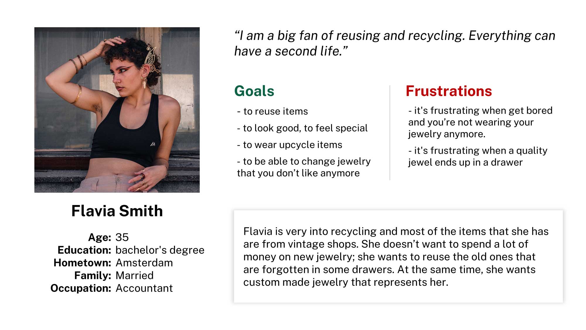
Flavia is an Accountant who needs to order unique jewelry using old jewelry as currency because she wants to feel special by wearing upcycled items.
Starting the design
Paper wireframes
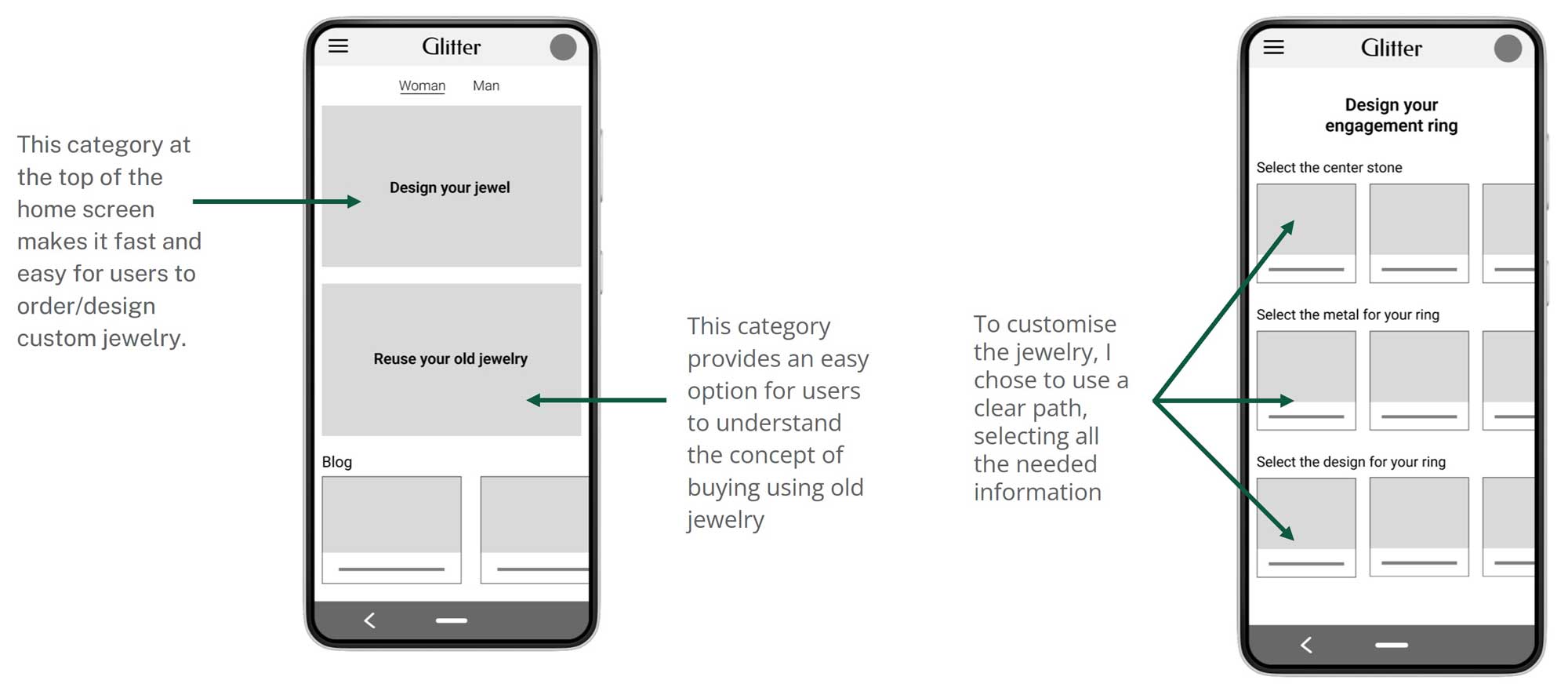
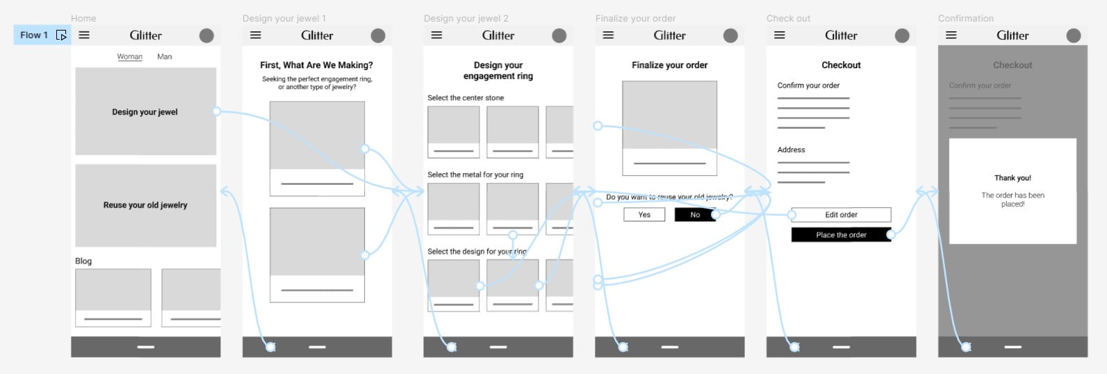
Taking the time to draft iterations of the home screen of the app on paper ensured that the elements that made it to digital wireframes would be well-suited to address user pain points. I prioritized a quick and easy designing process to help users save time and understand the concept of buying through old jewelry.
Usability study: findings
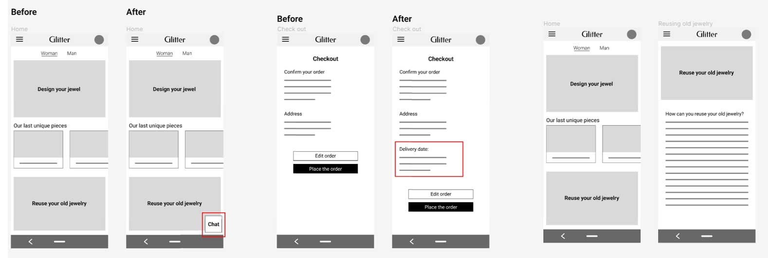
I conducted two rounds of usability studies. Findings from the first study helped guide the designs from wireframes to mockups. The second study used a high-fidelity prototype and revealed what aspects of the mockups needed refining.
Round 1 findings
- Users need to have a chat feature in the app
- Users need to see when the order will be delivered
- Users need all the information about the “reusing old jewelry option”
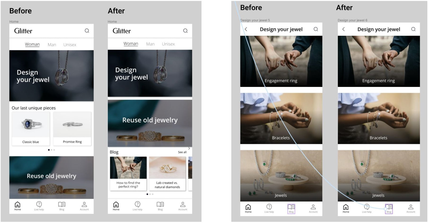
Round 2 findings
- User are confused about the already existing jewelry
- User can’t reach the blog page from bottom bar of the “design your jewel page”
Going forward
Takeaways
Impact
The app makes users feel like Glitter really thinks about how to meet their needs: to order unique jewelry using old jewelry as currency.
One quote from peer feedback:
“I would definitely use this app. I want it in real life!”
Next steps
- Conduct additional usability studies to confirm that the problems users encountered have been successfully resolved.
- Develop the app
What I learned
To successfully design something that solves users’ problems and meets their needs, I must be able to get out of my head, interact with a cross-section of users, empathize with them, and apply what they’ve shared to the product development process.
