The story behind of the brand naming is related to the client’s wish of going back to the roots of healthy sweets recipes that have been passed down from generation to generation.
Coacăzeeria is a combination of two Romanian words.
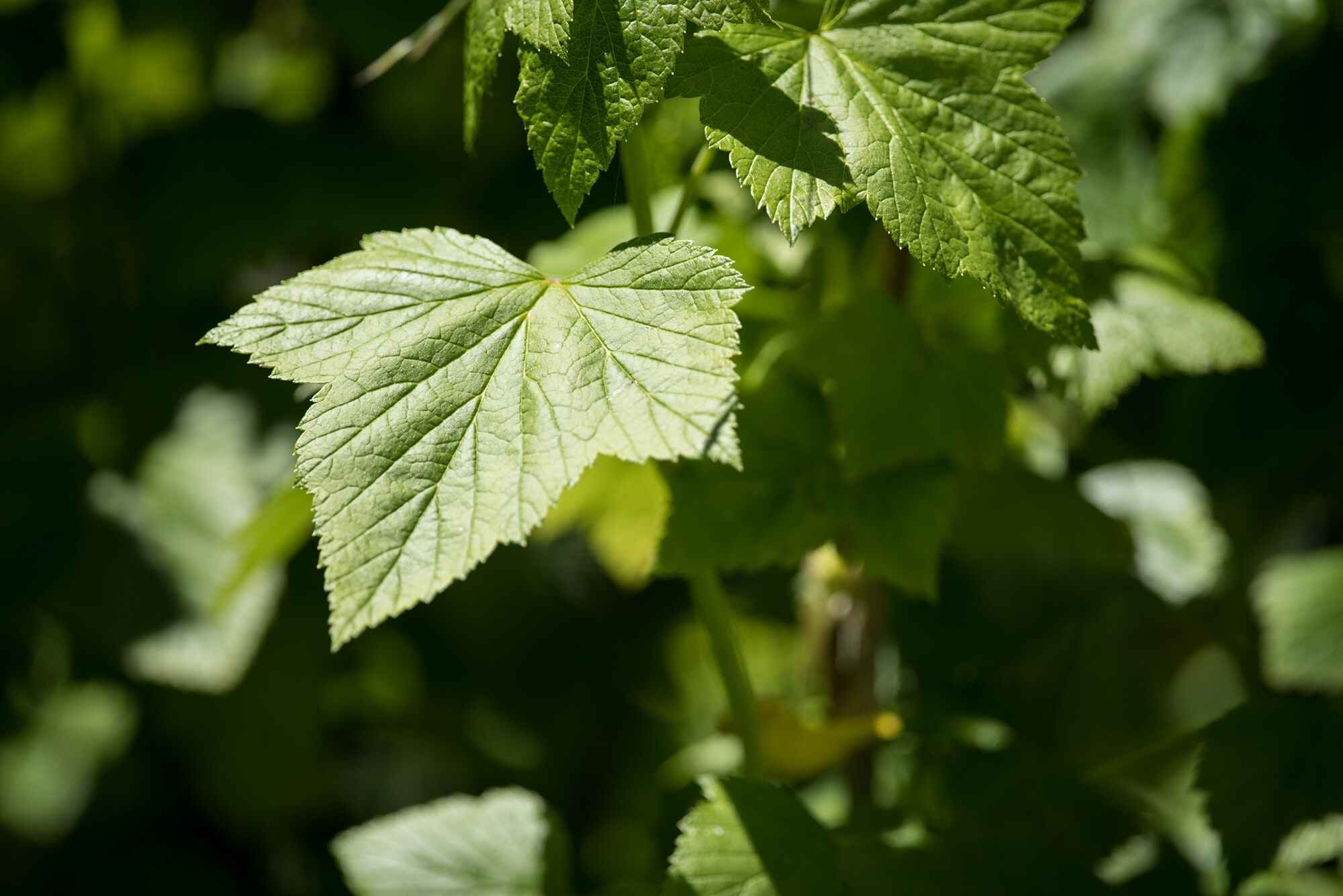
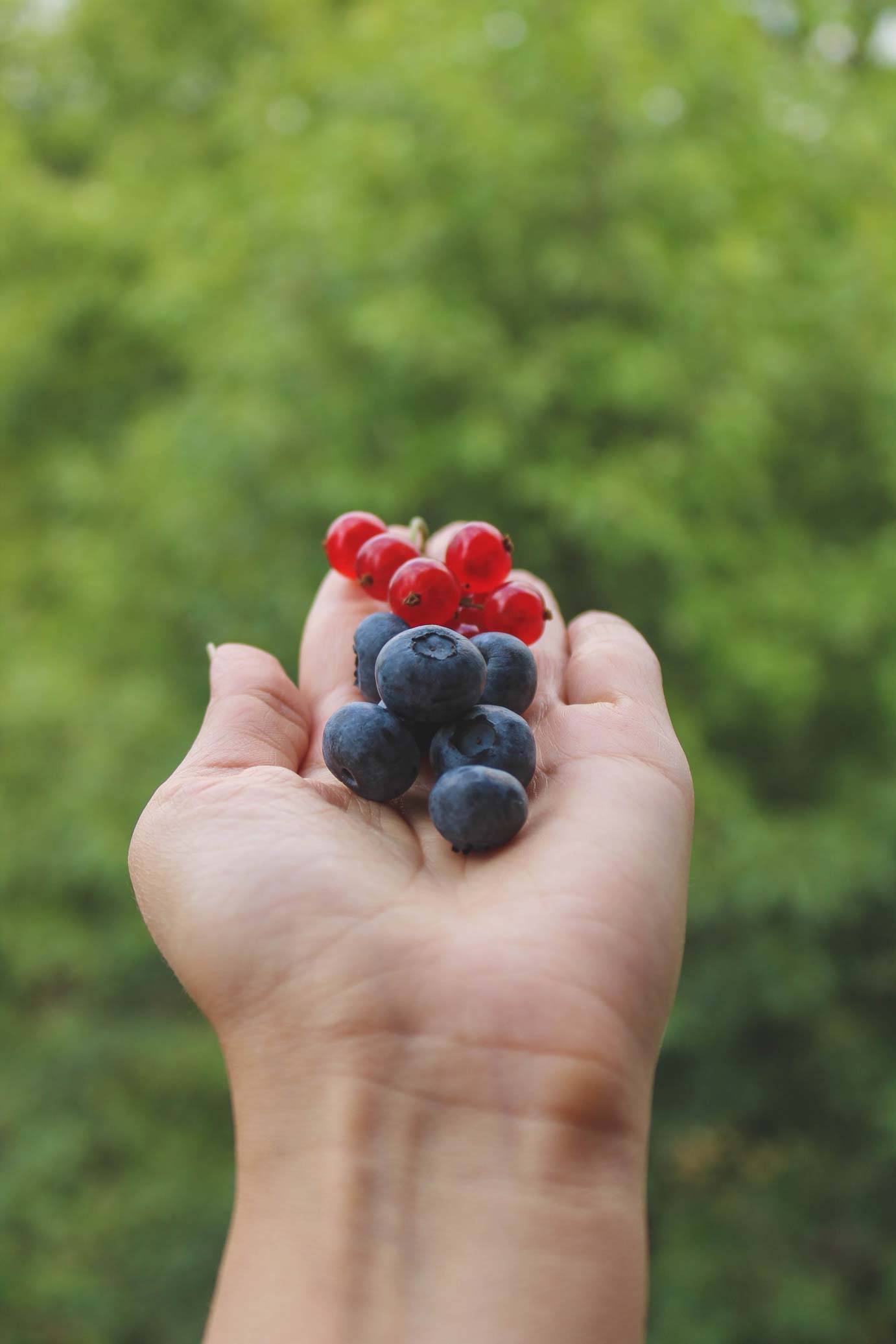
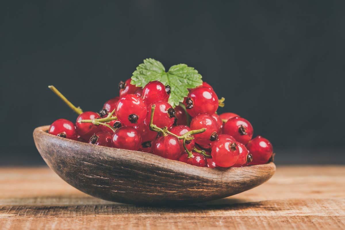
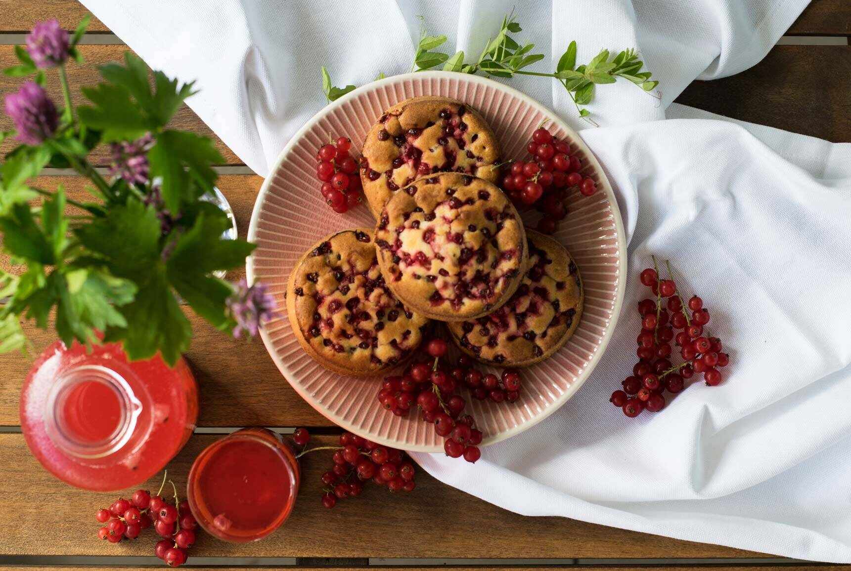
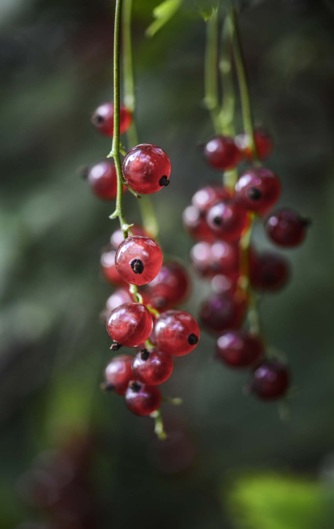
The word Coacăze, currants, which is the main ingredient in the products and the word Feerie, fairytale, like the feeling of amazement that the clients have when tasting the brand’s recipes.
Client
- Andreea Baciu
Deliverables
- Brand naming
- Logo design
- Logo animation
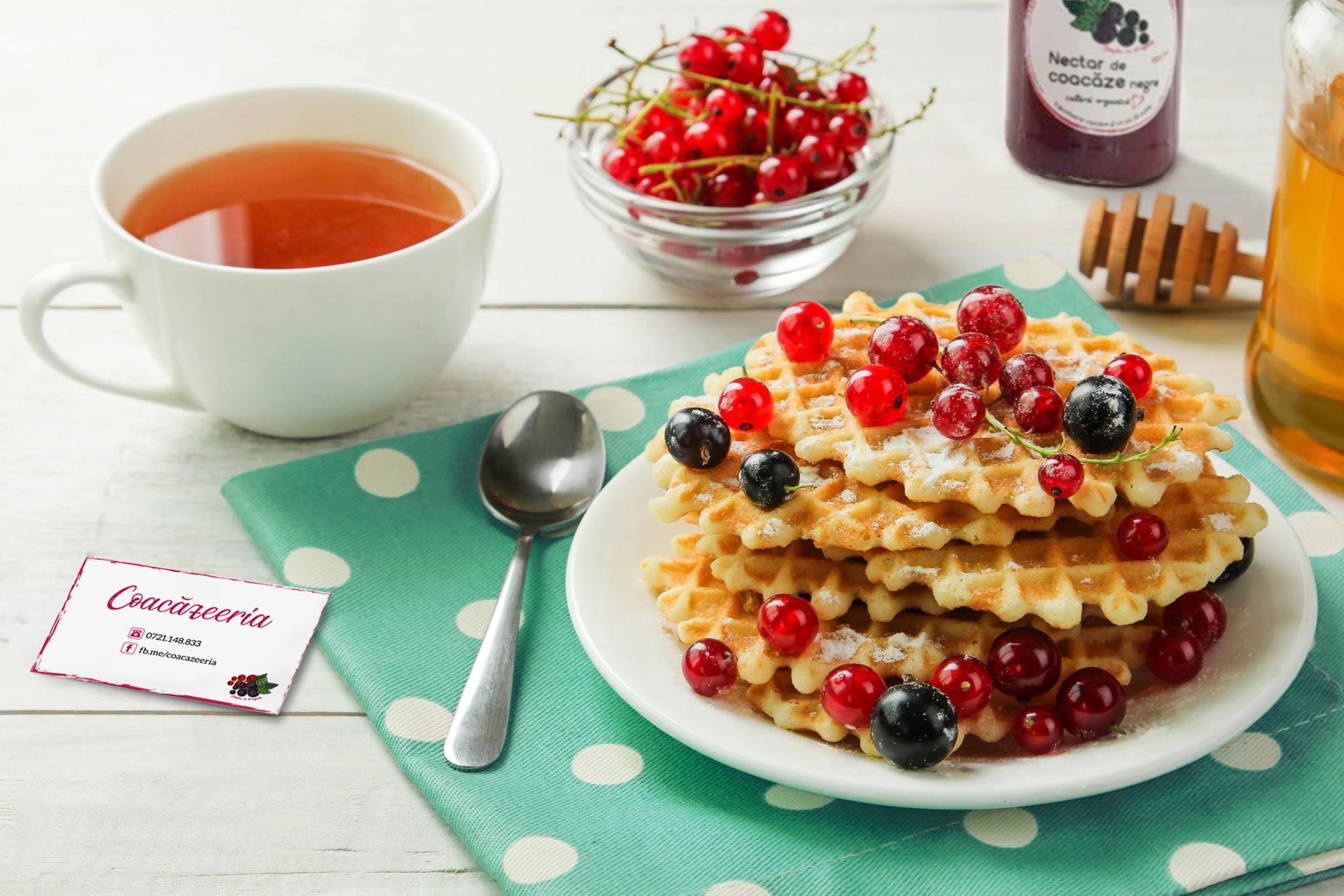
- Business cards design
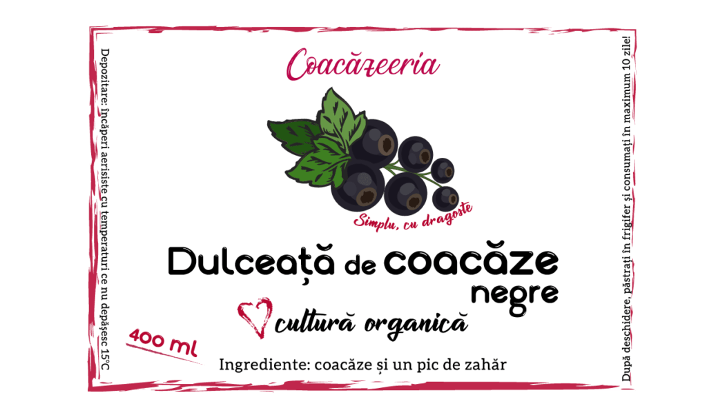
- Jam label design
- Syrup label design
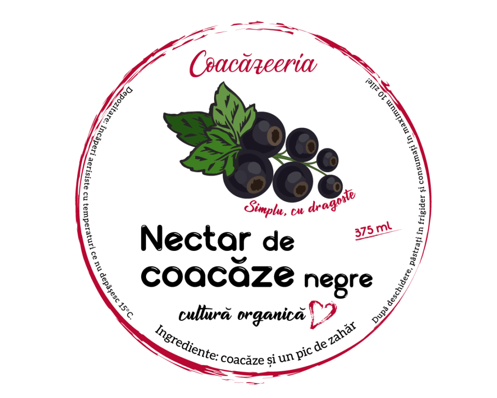
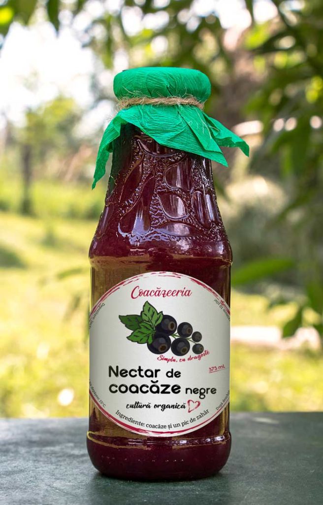
- Nectar label design
Logo Design &
Identity
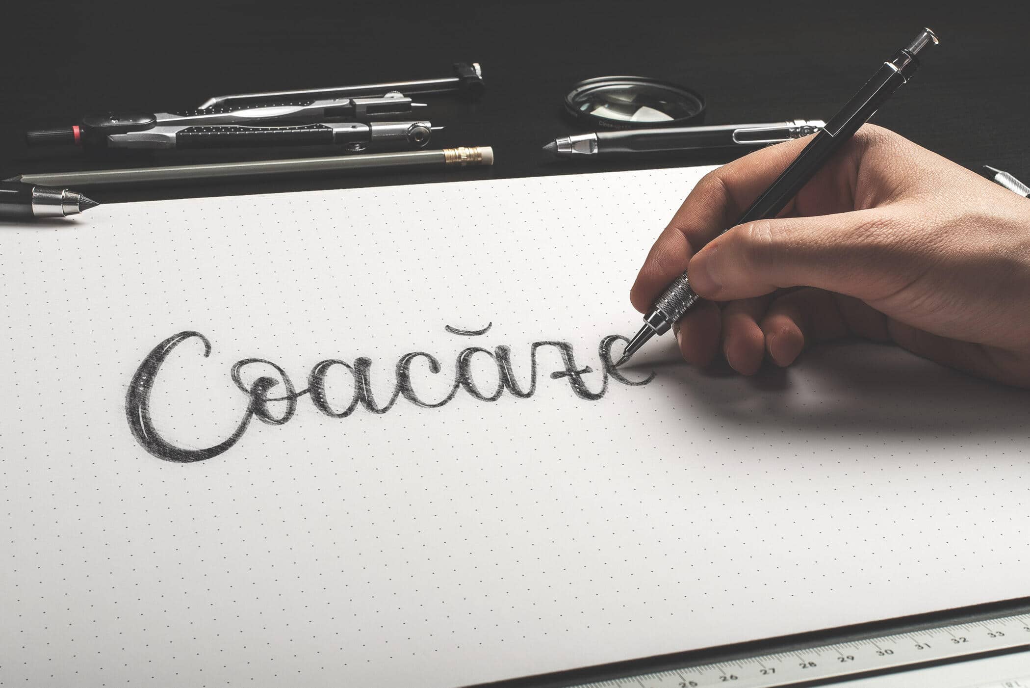
The reason for using a handwritten logo design was very simple after finding out the story behind the brand and what my client wanted to deliver.
Handwriting is great in representing what Coacăzeeria is about – personal connection with its customers. It also relates to the brand uniqueness – that all product are handmade.

Labels design& Simulations
Packaging Design
Simple, with love
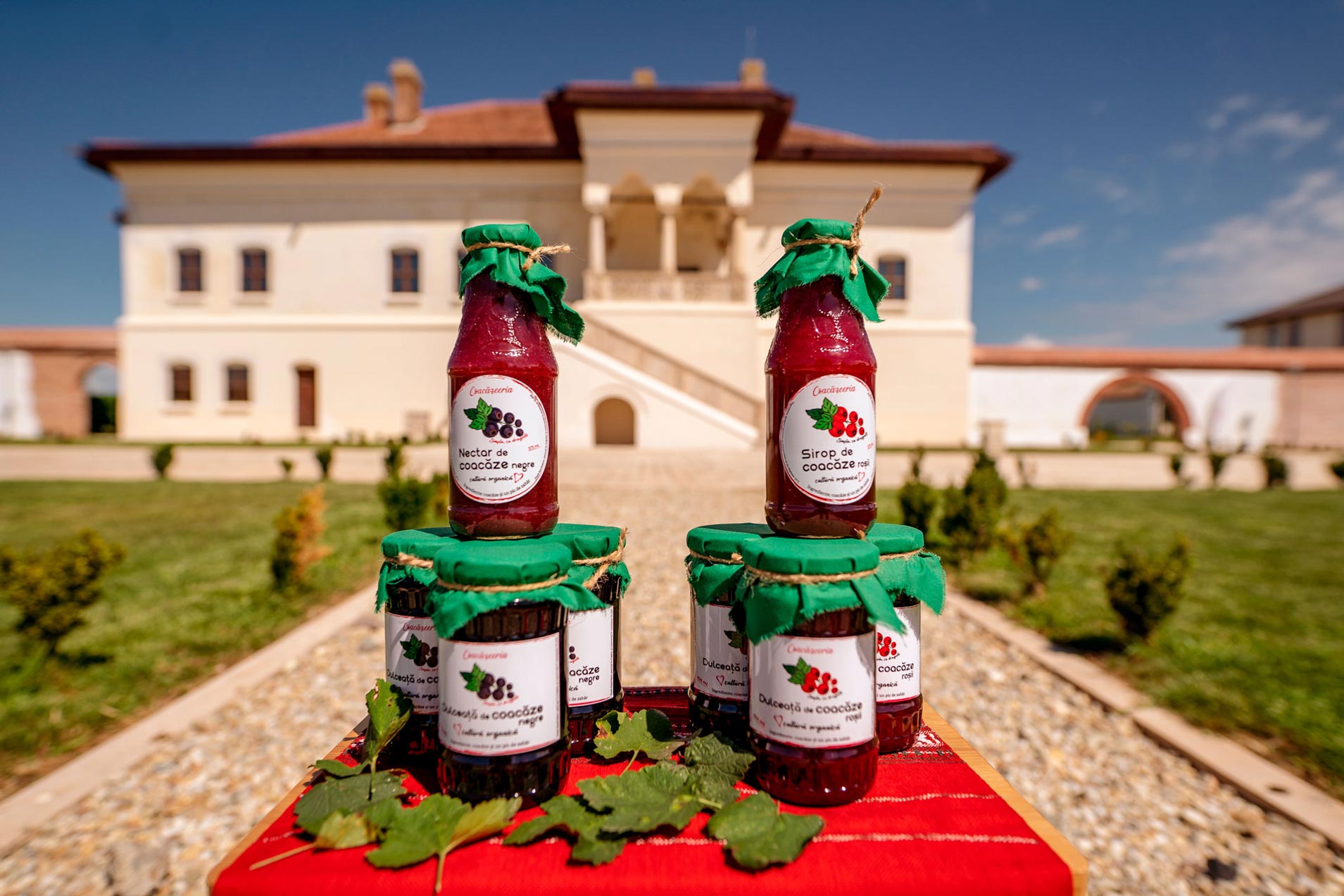
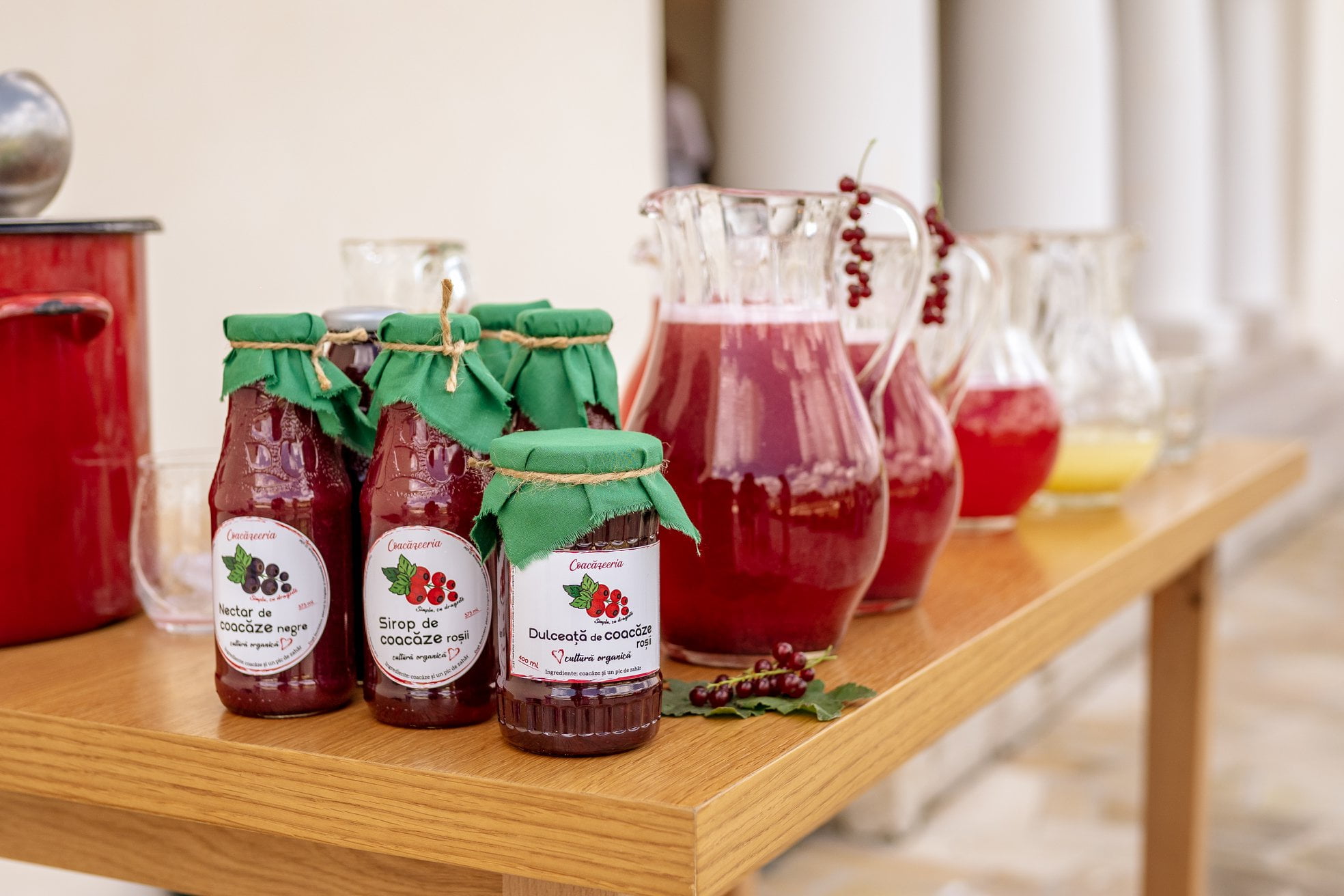
Consumers first come in contact with packaging before opening it and seeing the product inside.
So, the packaging is responsible for making the first impression on consumers when the product is on the shelf.
Coacăzeeria ‘s packaging design motto was keeping it simple, such as the recipes of the products do, with fewer visual elements that don’t weigh down the design and makes it easier for the customer to focus on what is important – the natural ingredients.
