Beetreat is a family business born out of a passion for beekeeping. It has evolved from a simple hobby into an authentic brand based on love, curiosity, and dedication.
The client wanted the brand identity to express simplicity and authenticity. Thus, Beetreat was born, a brand with a visual identity that highlights their story.
Understanding the client’s story and needs
- We started with an in-depth discussion to understand the essence of their business, the values they promote, and the message they want to convey.
- We discovered that Beetreat is more than a business; it is a story about passion, dedication, and family bonds.
Client
- Cristina Gheorghe
Deliverables
- Brand name
- Logo design
- Honey label design
Brand name
After detailed research to understand the market, competition, and trends in the beekeeping industry, we analyzed key elements that could best represent the brand and resonate with the target audience.
After multiple brainstorming sessions and association tests, we selected the best proposals:
- Beetreat: bee + treat (representing a treat from bees)
- Apiness: Apiculture + Happiness
- Beesnees: Bee’s + knees (something highly admired)
A good brand name must meet the following criteria: it should fulfill the client’s requirements, be unique and memorable, and have an available domain for the website.
Logo Design &
Identity
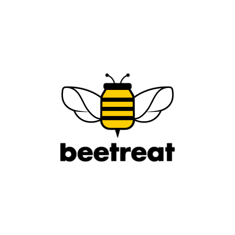
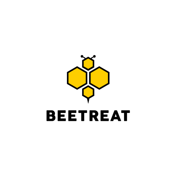
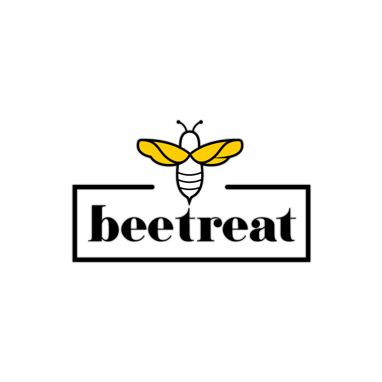
For the logo design, we created three logo variants, focusing on simplicity and minimalism. The final variant was chosen for its clarity and elegance, perfectly representing Beetreat’s values.
- The idea behind the first proposal is a bee with a jar-shaped body, suggesting both the final product and its natural, authentic nature.
- The second proposal centers on an abstract design with hexagons representing honeycombs, emphasizing the natural and structured element of the product.
- In the third proposal, the logo combines the image of a bee with the brand name inside a frame, creating a balanced look.
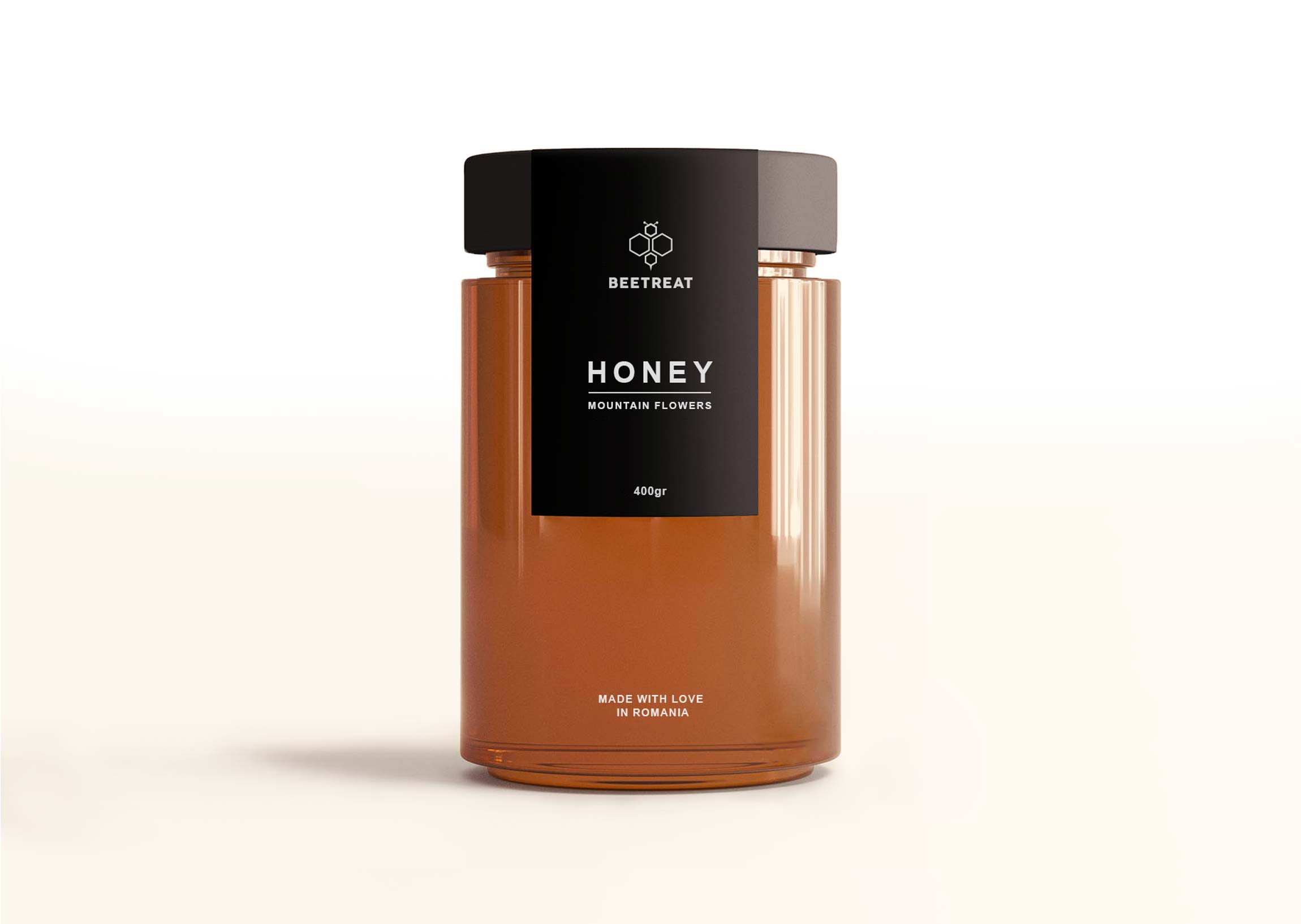
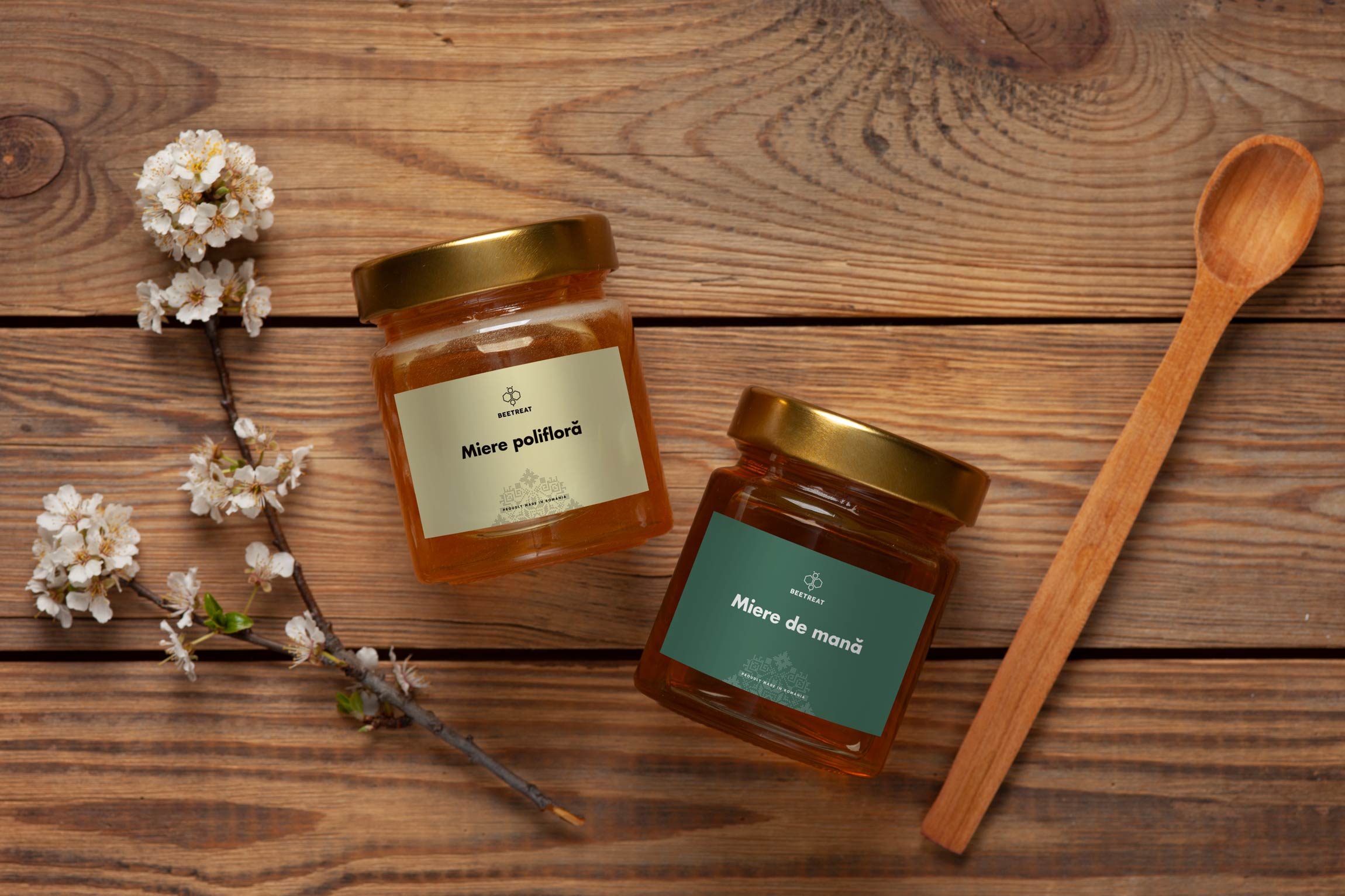
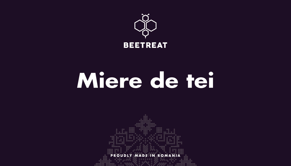
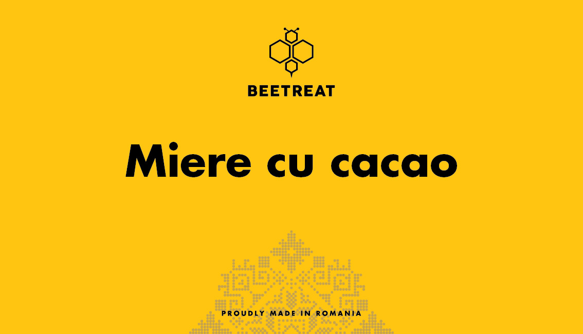
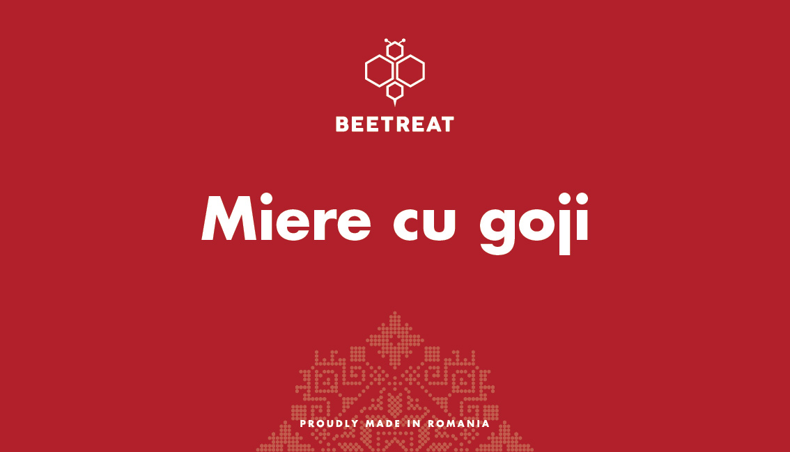
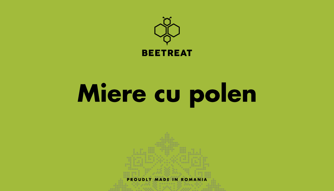
Label design
The product labels were designed in a minimalist style, emphasizing natural elements and simplicity. We used natural colors and clean shapes to reflect the purity and authenticity of Beetreat’s products.
Additionally, we integrated a pattern of hexagons, similar to those in the brand’s logo, which represents traditional Romanian motifs. This pattern adds a cultural and authentic touch, highlighting the brand’s connection to local traditions and values.


