Project overview
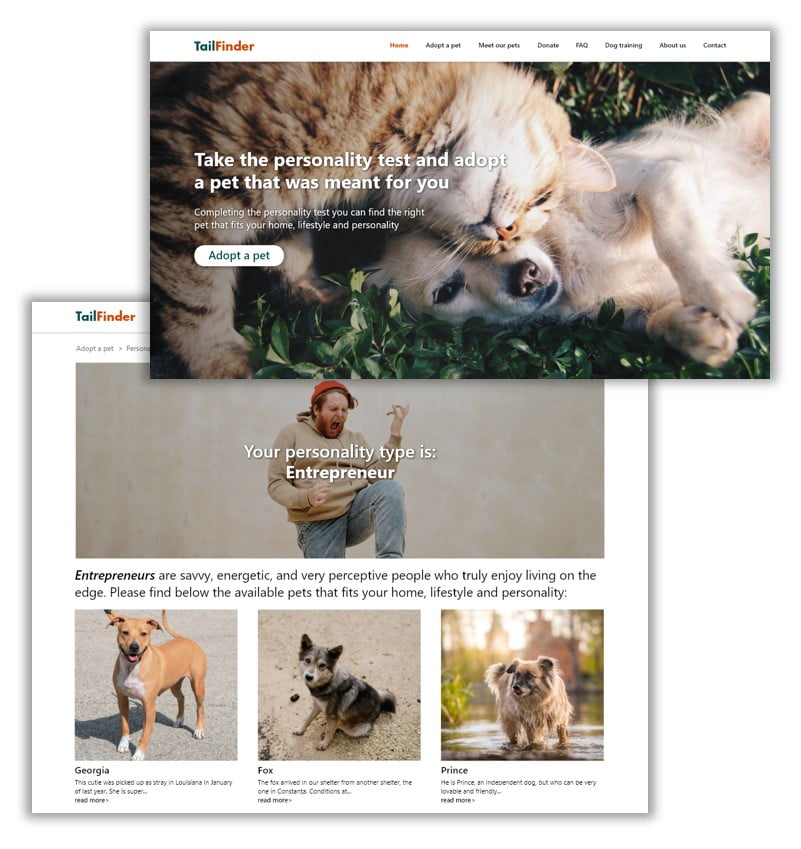
TailFinder is a website to help people find the right pet that fits to their home, lifestyle and personality by completing a personality test.
The problem
- Finding the right pet regarding their temper / personality;
- Concerns about taking care of it.
The goal
Design a website that allows user to find the right pet that fits to their home, lifestyle and personality by completing a personality test.
Target audience
Primarily, users are female aged between 25-54 as well as families with kids
My role
UX designer designing TailFinder website from conception to delivery.
Responsibilities
Conducting interviews, paper and digital wireframing, low and high-fidelity prototyping, conducting usability studies, accounting for accessibility, and iterating on designs.
Understanding the user
User research: summary
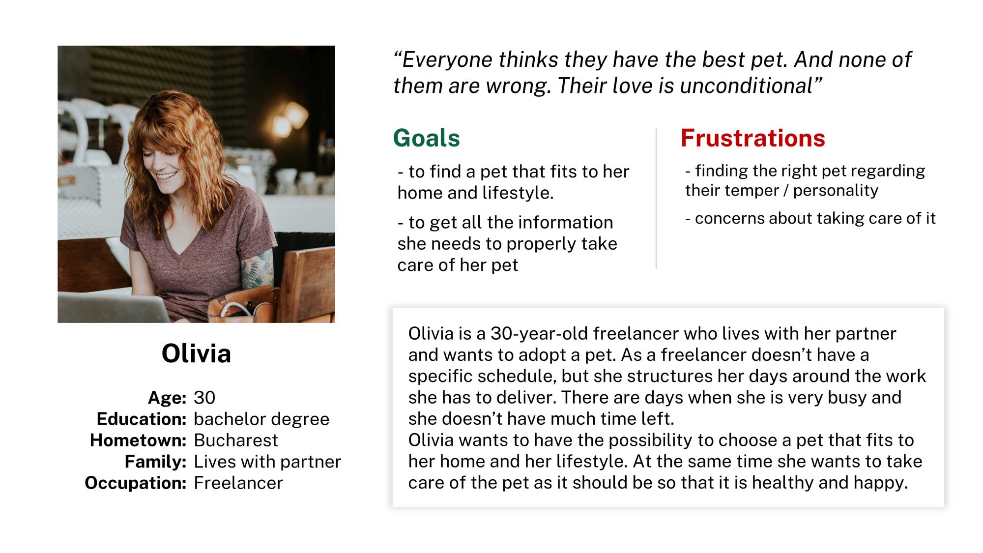
I conducted user interviews and created empathy maps to better understand the users I’m designing for and their needs. I discovered that many target users were anxious when they thought about adopting a pet that doesn’t fit to their personality.
They also need to have all the information to properly take care of their new pet.
Problem statement
Olivia is a freelancer who needs to adopt a pet that fits to their home, lifestyle and personality because they need to properly take care of their new pet.
Paper wireframes
Taking the time to draft iterations of the home screen on paper ensured that the elements that made it to digital wireframes would be well-suited to address user pain points. I prioritized a quick and easy designing process to help users save time.
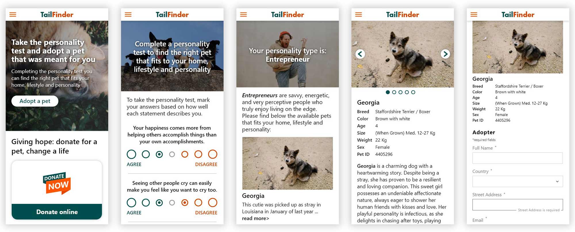
Because TailFinder’s customers access the site on a variety of different devices, I started to work on designs for additional screen sizes to make sure the site would be fully responsive.
Digital wireframes
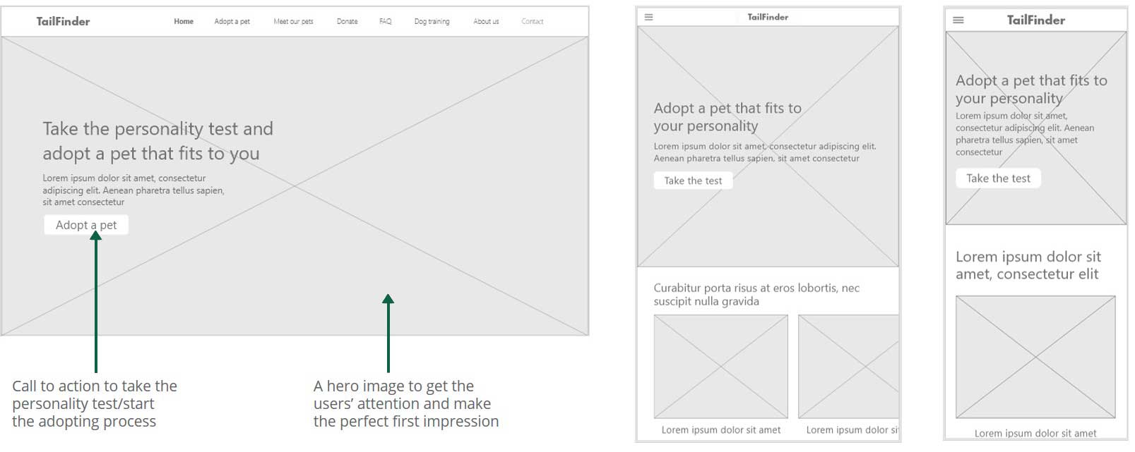
As the initial design phase continued, I made sure to base screen designs on feedback and finding from the user research.
Low-fidelity prototype
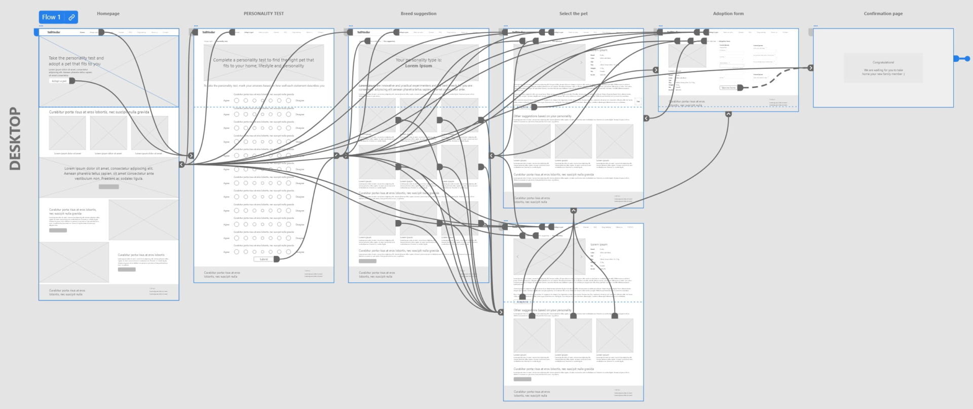
Using the digital wireframes, I created a low-fidelity prototype. The primary user flow I connected was adopting a pet, so the prototype could be used in a usability study.
Usability study: findings
I conducted one round of usability studies. Findings helped guide the designs from wireframes to mockups.
Findings
- Navigation menu disappearing when scrolling
- Users weren’t be able to select other pet suggestions based on the test’s results
- Users asked for an online assistant / chat feature
Refining the design
Mockups

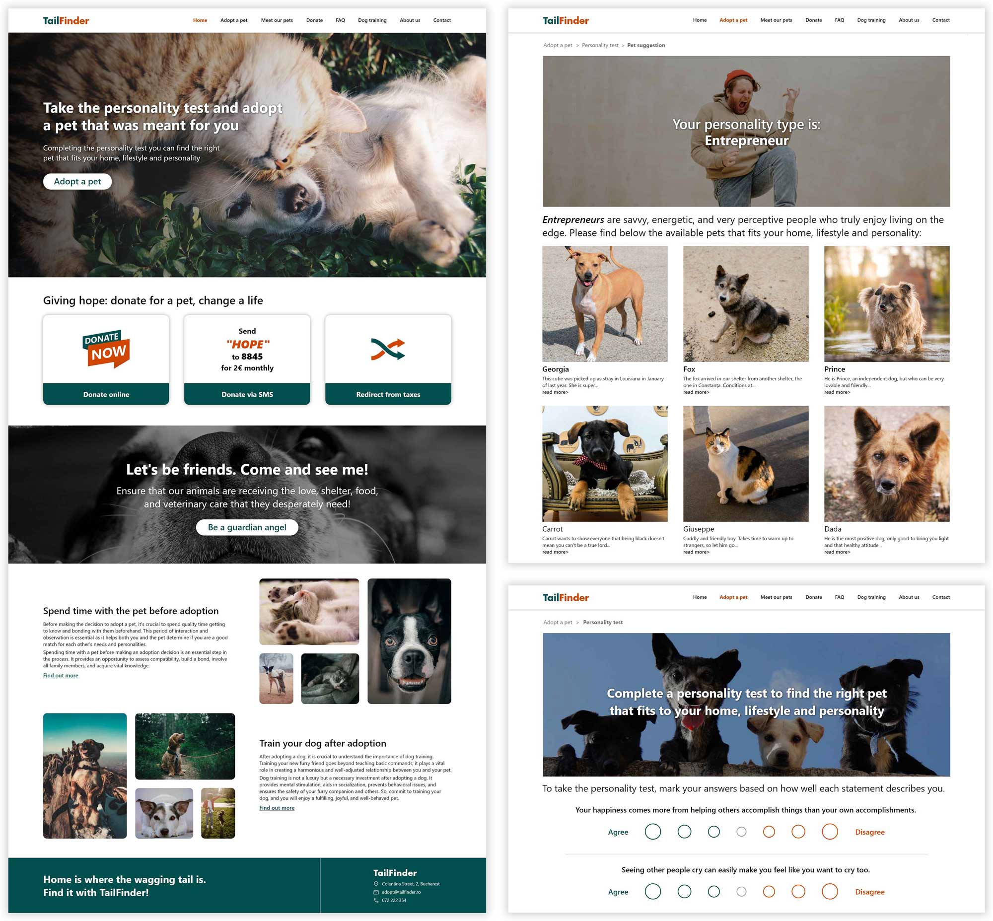
Based on the insights from the usability study, I made changes to improve the navigation of the website: the navigation menu is no longer disappearing when scrolling.
I also added an option to have a chat feature in the website.

Desktop
Mobile version
Going forward
Takeaways
Impact
Our target users shared that the design was intuitive to navigate through, more engaging with the images, and demonstrated a clear visual hierarchy.
Next steps
- Conduct additional usability studies to confirm that the problems users
encountered have been successfully resolved. - Identify any additional areas of need and ideate on new features
- Develop the website
What I learned
The most important takeaway for me is to always focus on the real needs of the user when coming up with design ideas and solutions.

