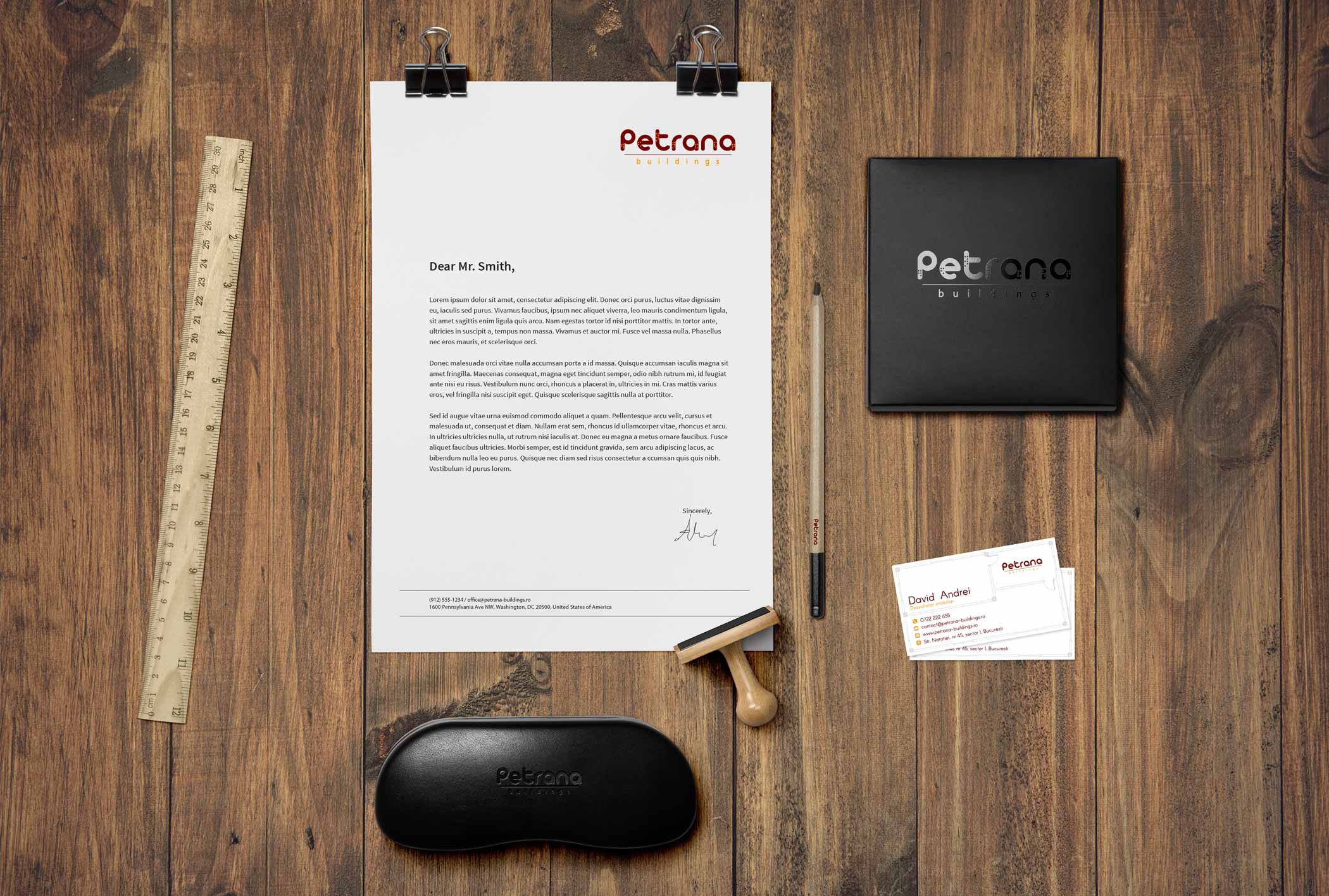
The project for Petrana Partners was very comprehensive and integrated elements of graphic design in order to create a complete brand identity.
The aim in constructing the brand identity was to make it recognizable while standing out among other real estate brands.
Client
- Petrana Partners
Deliverables
- Logo design
- Logo animation
- Business cards design
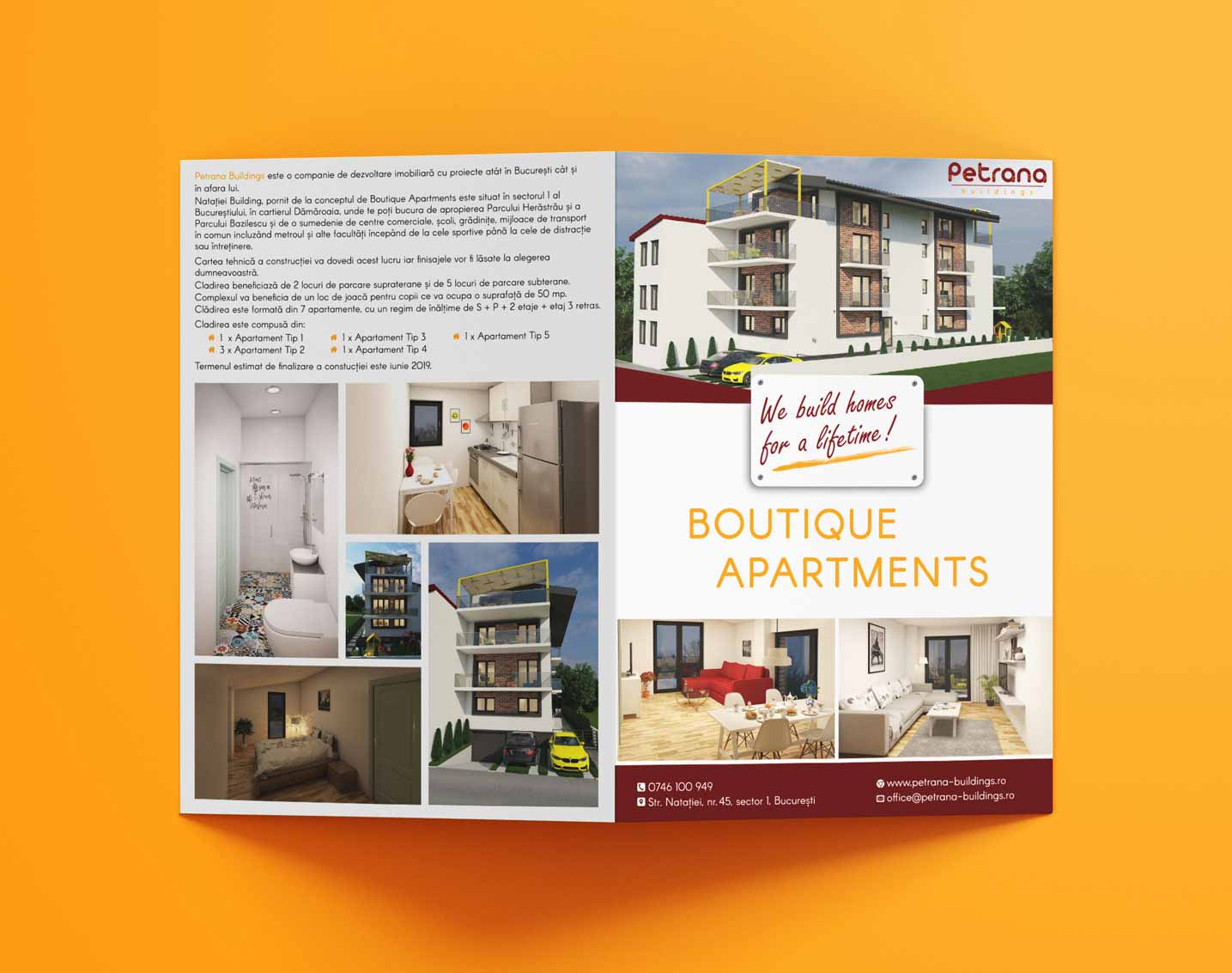
- Leaflet design
- Website design
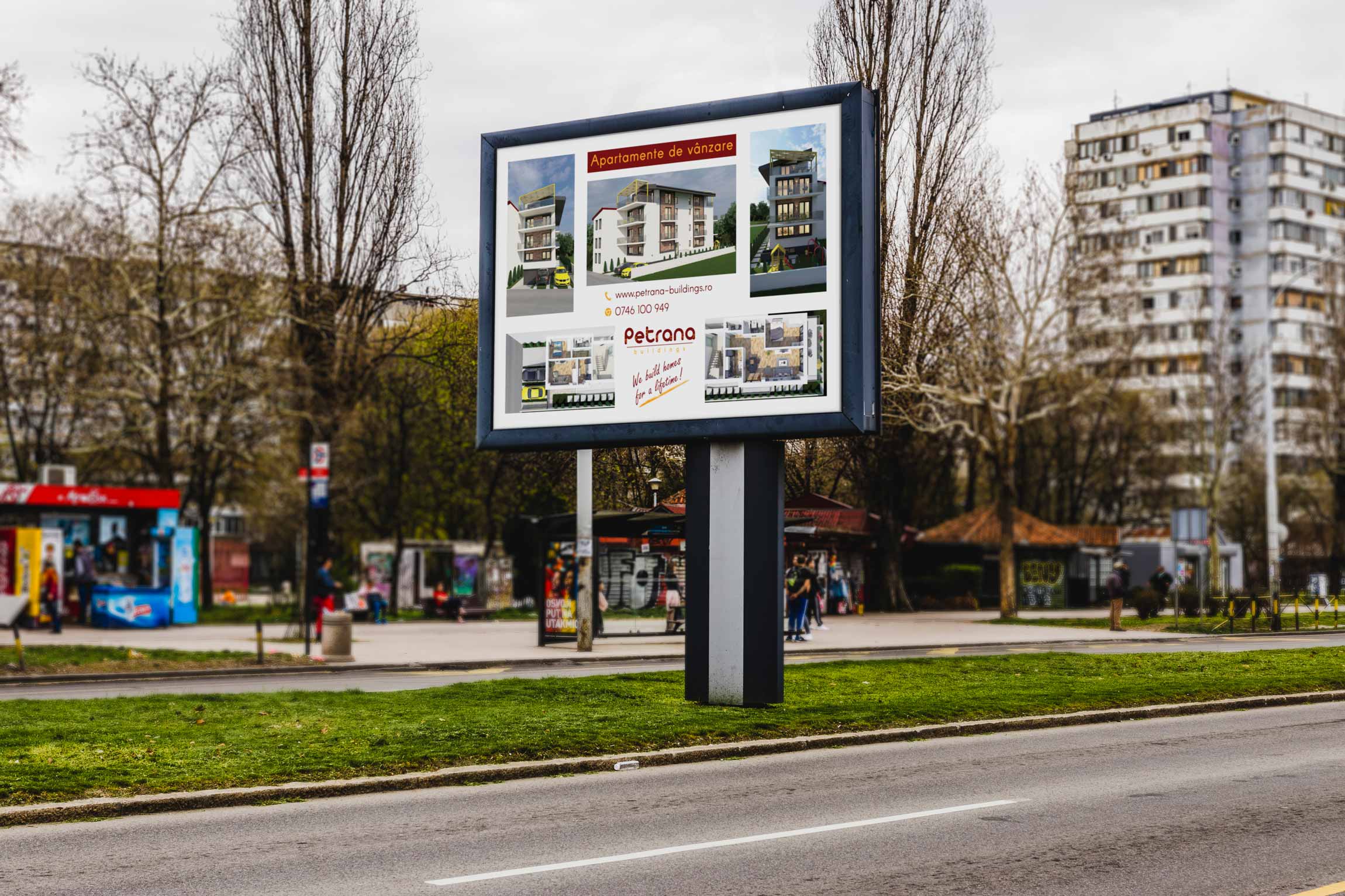
- Banners design
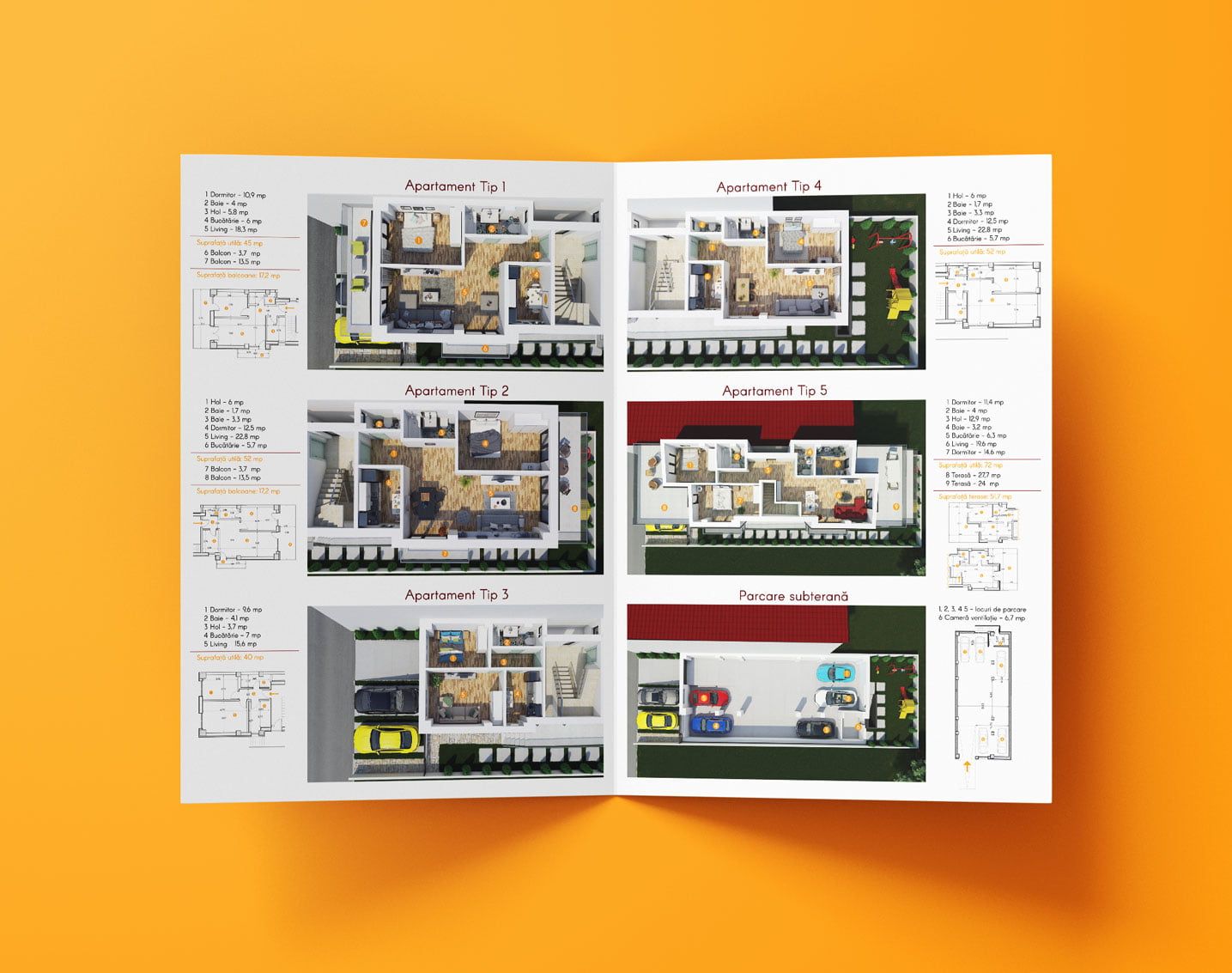
- 3D architectural rendering
Logo Design &
Identity
Defining a Real Estate Logo
As it was mentioned in the client brief, the logo is supposed to raise awareness and recognition on the brand, but also to follow the brand’s key values and principles.
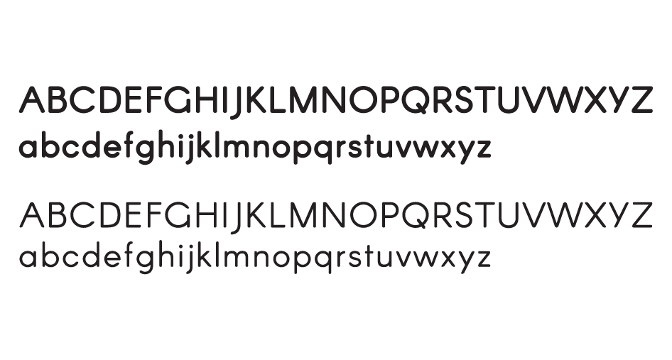
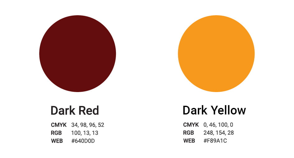
To do so I have based the design of the logo on shapes – the font of the letters is curved and gives the feeling of comfort, protection and being connected, while the squares, windows provide order and security; and on colors – with dark red as strength and courage and dark yellow as enthusiasm and energy. All of the above are animated into a construction showing that Petrana is all about delivering quality buildings.
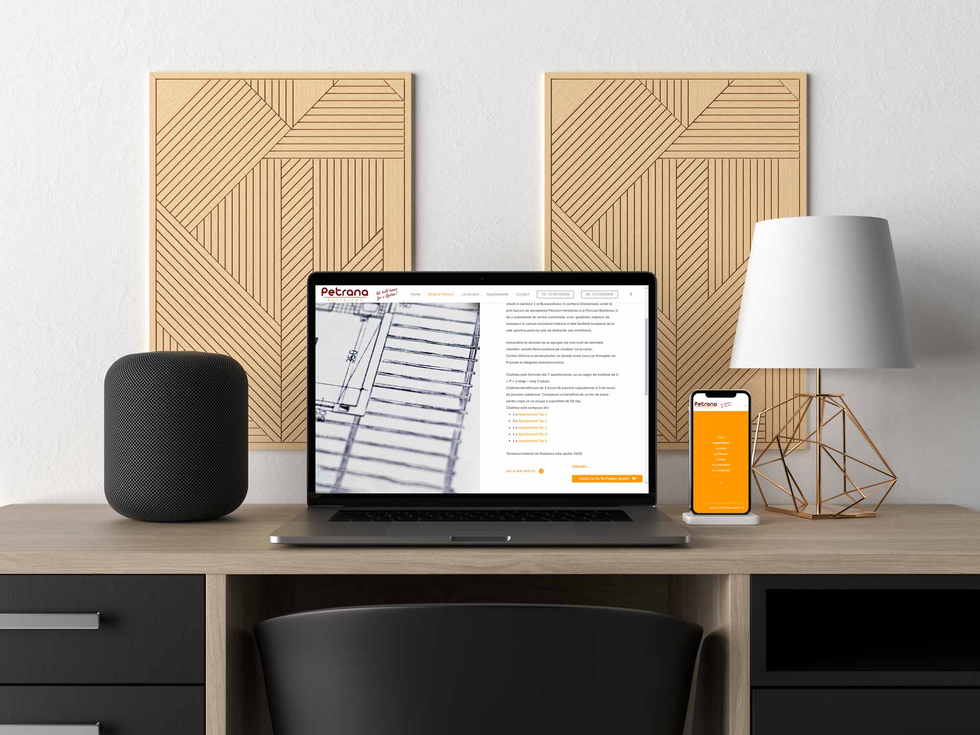
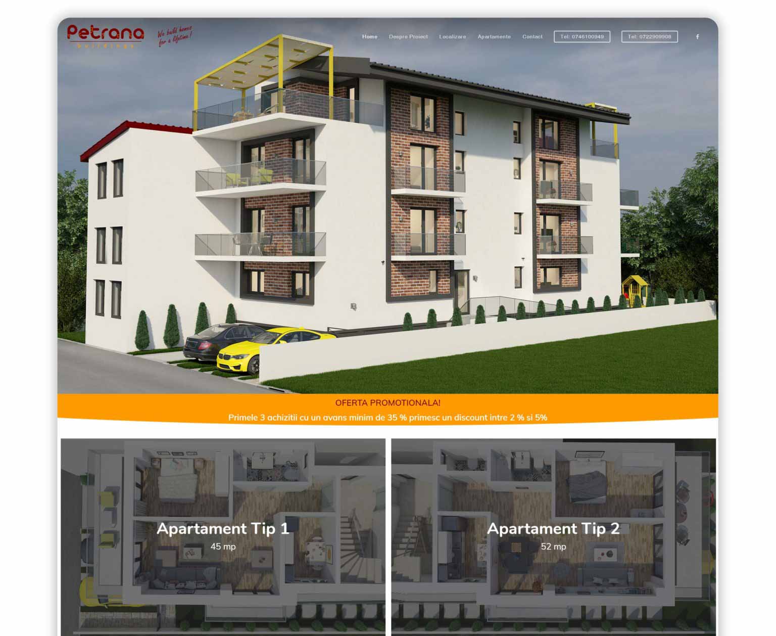
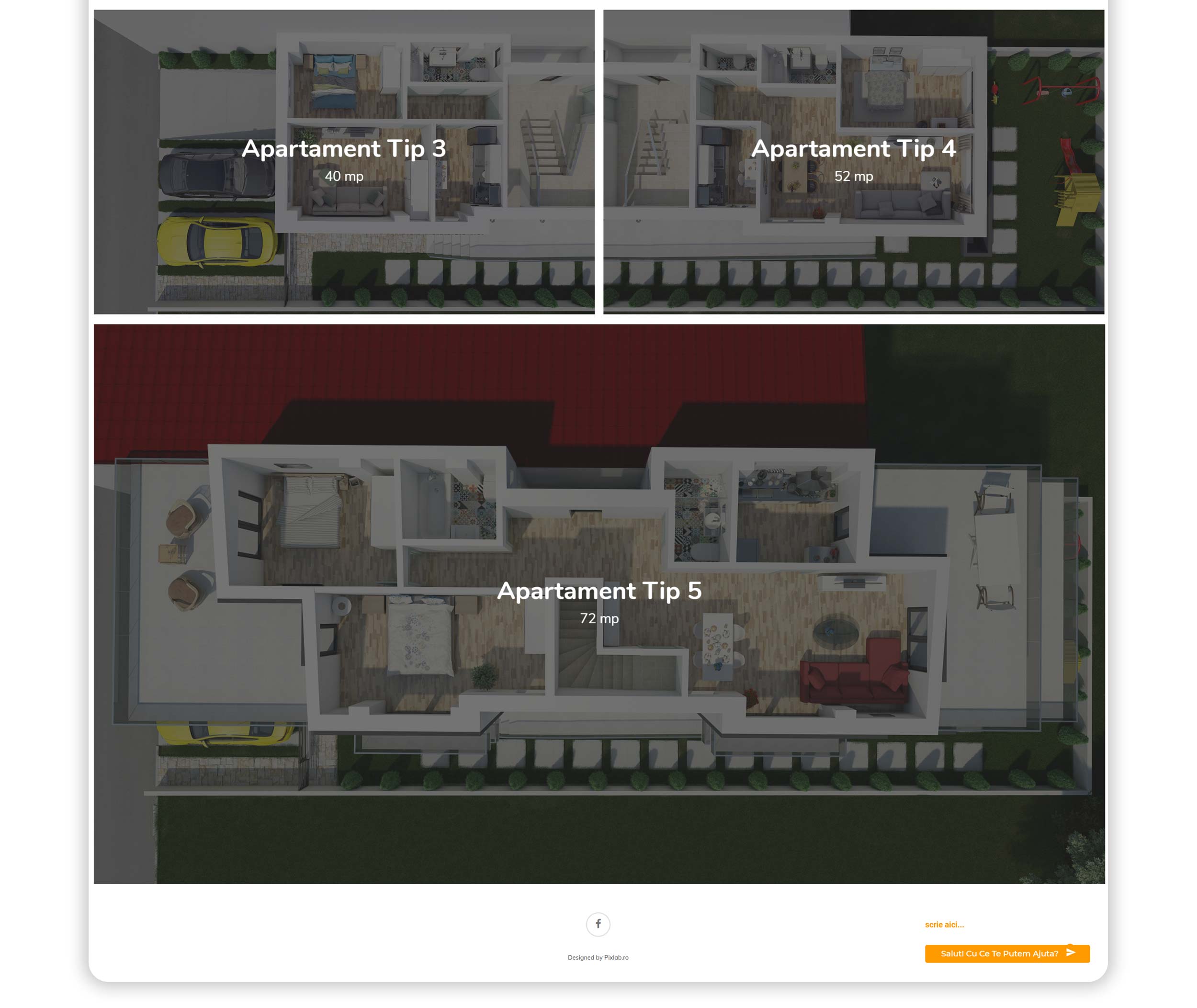
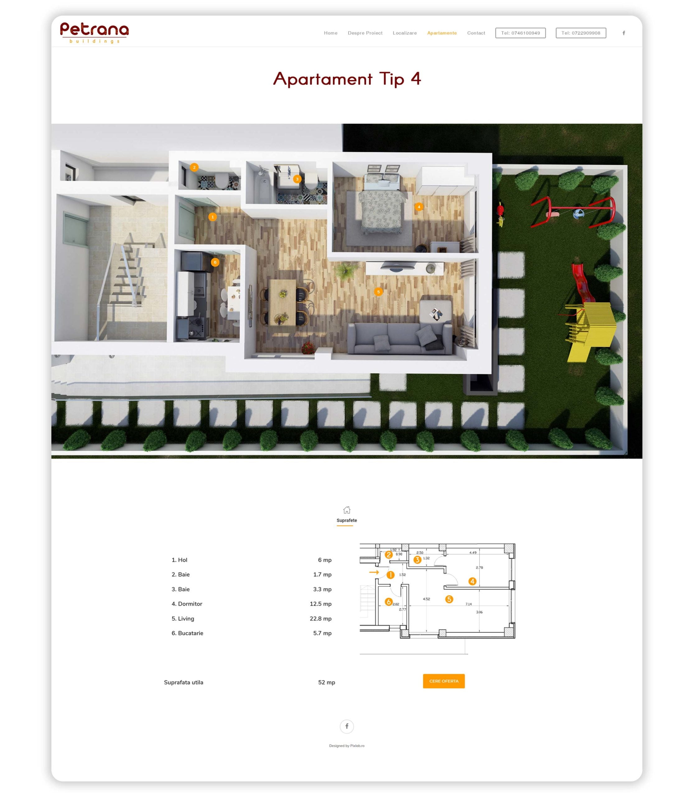
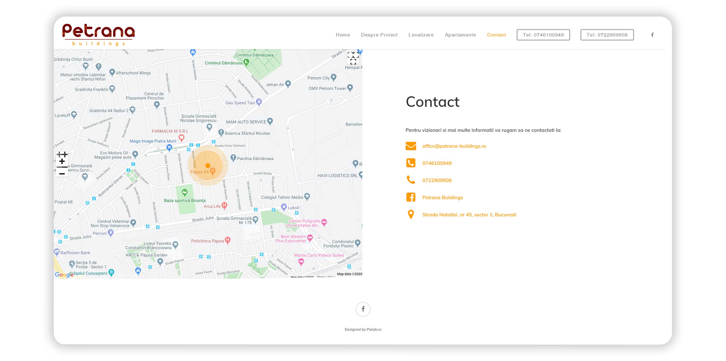
Website
Straight forward…
When a website is designed the right way, this has an enormous impact on the business.
Petrana website is based on two principles – visual appeal and user-friendly. This website design fulfills its intended function by conveying its particular message whilst simultaneously engaging the visitor.